Motivation
When investigating stocks to buy, investors typically rely on comparisons as their primary method of analysis. Tools such as Google Finance, Yahoo Finance, and Seeking Alpha provide access to large market datasets, but fall short in two critical ways: they offer limited support for custom query-building across meta-data, and they provide only restricted options for comparing multiple stocks simultaneously within a single view.
Most platforms present visualisation and analysis as separate workflows — a user either browses data or configures a chart, rarely both at once. This separation limits the potential for genuinely exploratory investigation. FinVis was designed to close this gap: a web-based visual analytics platform where queries, portfolios, chart configuration, and interactive visualisation all coexist in a unified interface.
Research Problem
The thesis explored whether an integrated, query-driven exploratory visualisation tool could meaningfully improve how investors discover and compare stocks — and how such a tool would compare against established platforms in practical case studies. The central research question was: can exploratory financial visualisation, combining custom meta-data queries with real-time interactive display, deliver capabilities that exceed what current mainstream tools offer?
The Interface
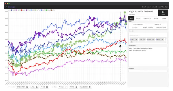
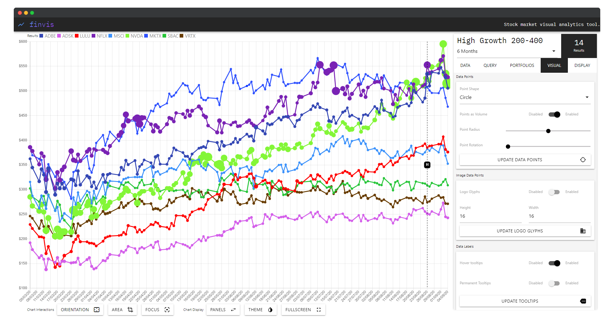
FinVis is structured around a persistent side panel with four functional tabs — Query, Portfolio, Visual, and Display — overlaid on a central interactive chart area. A bottom toolbar provides global controls: orientation, area, focus, zoom, child grouping, panel visibility, theme, and fullscreen mode.
Query Tab
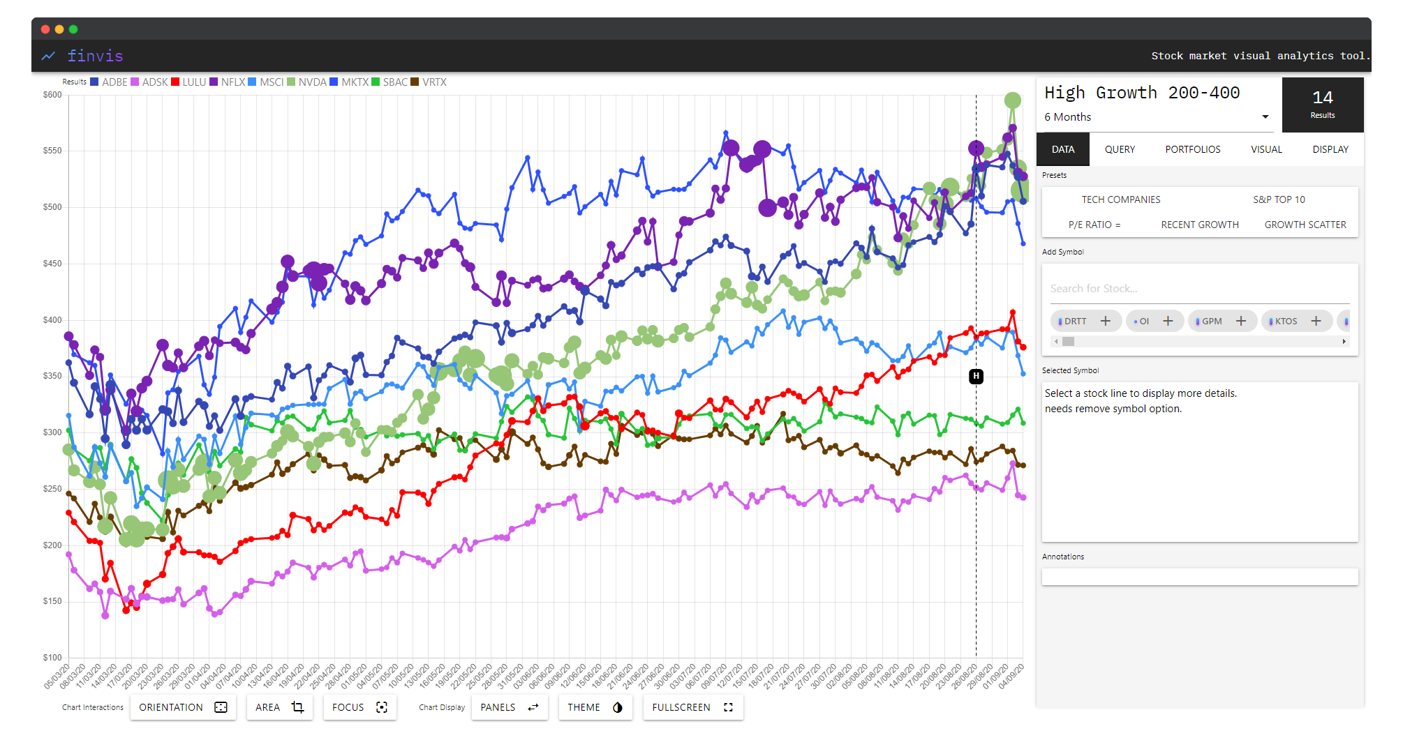
The Query tab is the entry point for exploration. Users define criteria against stock meta-data — filtering by sector, growth range, volume, market cap, or other parameters — and the system executes the query live against its dataset. Over 500 stocks are available for direct querying, with results immediately rendered to the chart. The most recent query always persists in the interface, allowing rapid iteration.
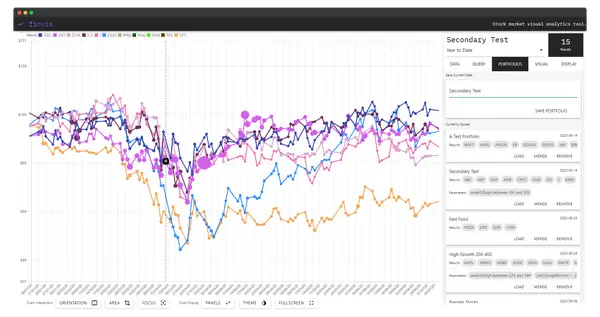
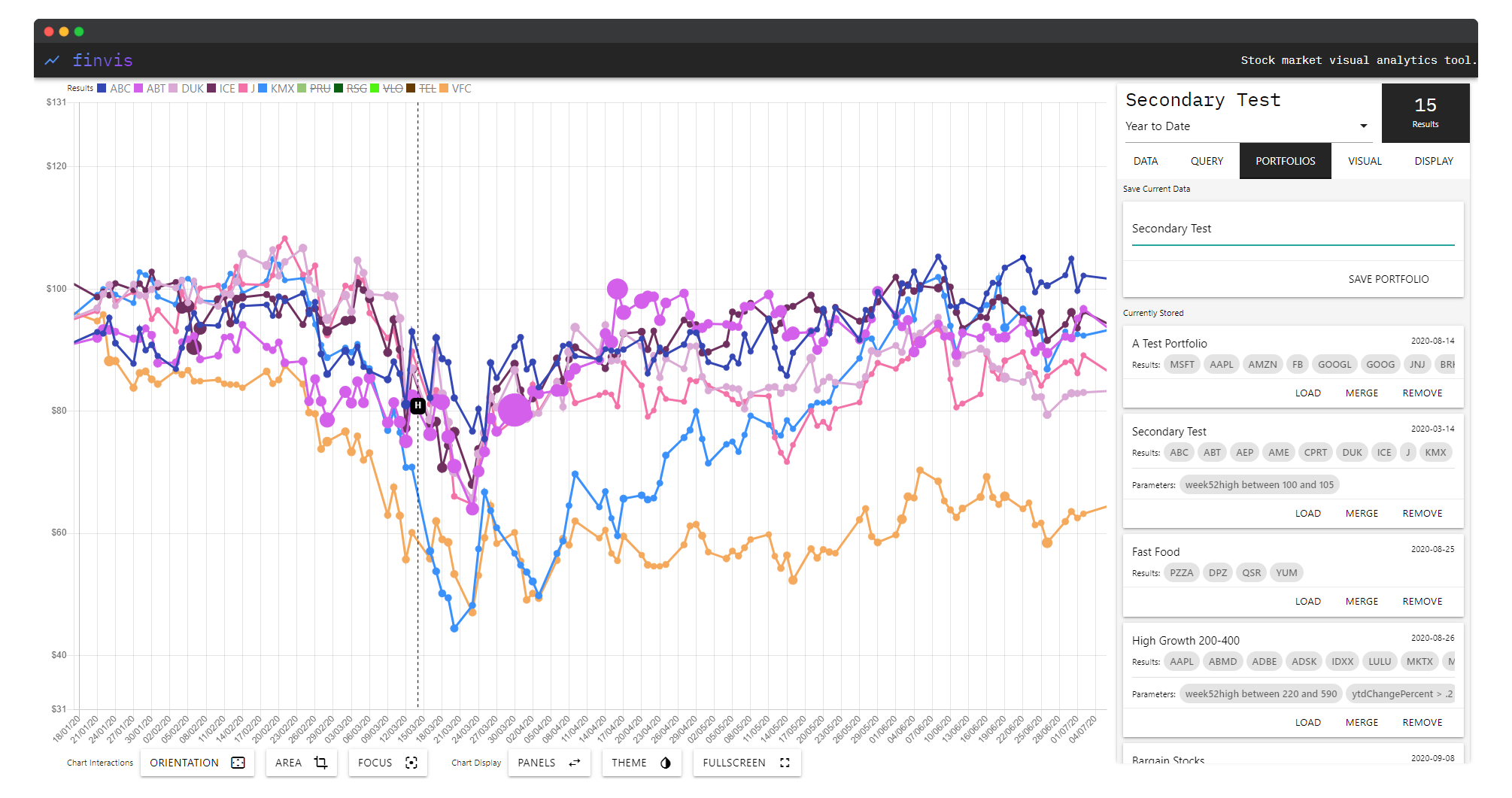
Portfolio Tab
The Portfolio tab provides a personal data store for saving and managing collections of stocks. Named portfolios — such as “High Growth 200-400”, “Secondary Test”, or “Test Fund” — can be saved, loaded, renamed, and removed. Crucially, multiple portfolios can be loaded simultaneously, stacking their stock sets into the same chart view for direct visual comparison. Up to 10,000 stocks can be imported this way, making the system capable of large-scale comparative analysis.
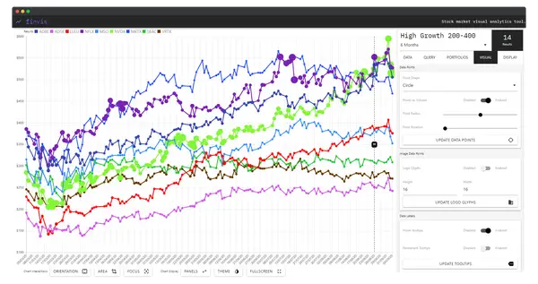
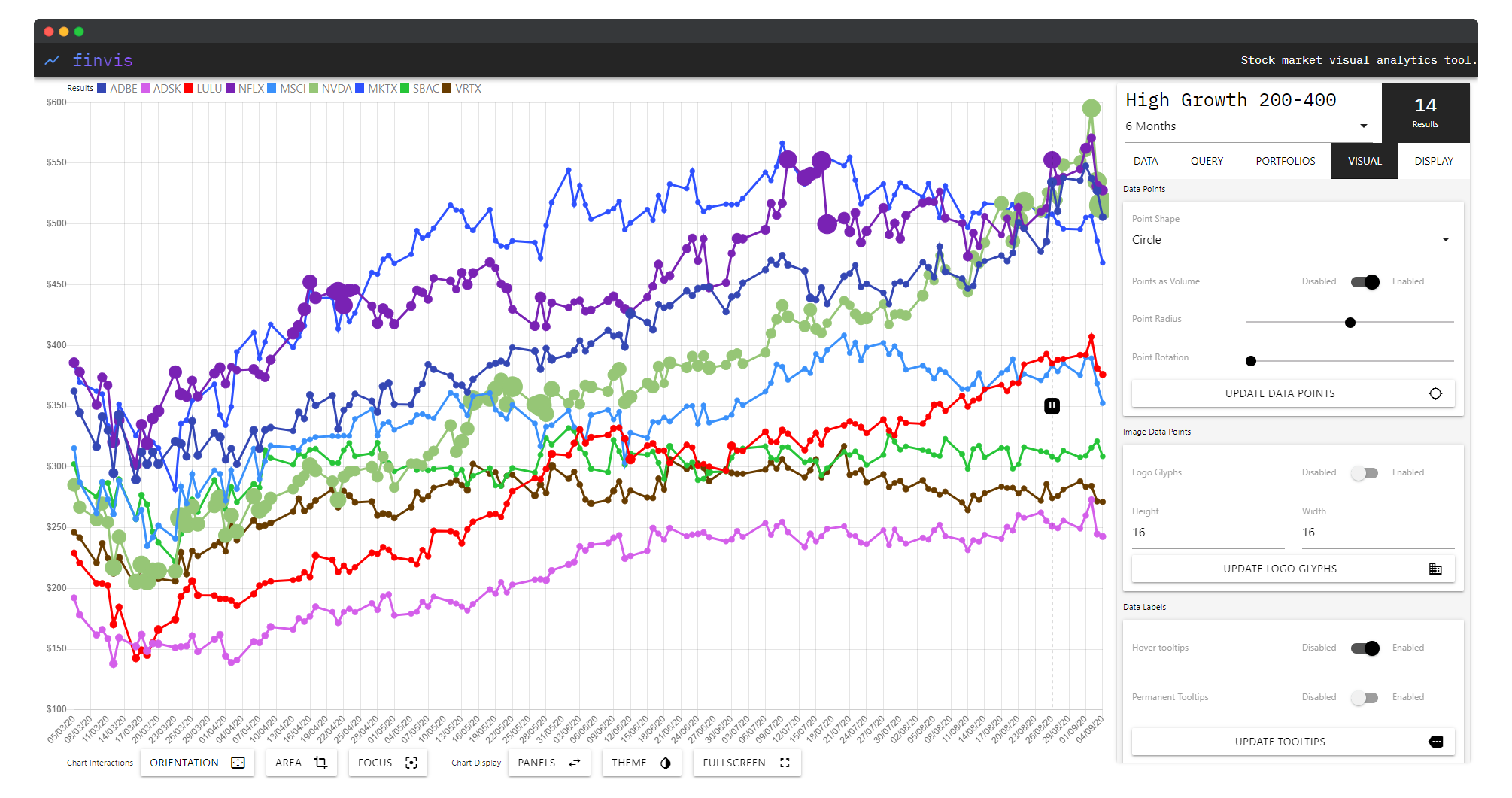
Visual Tab
The Visual tab exposes the chart’s rendering layer to the user. Four independent controls adjust the display without reloading data:
- Data Points — toggle circular markers at each data point on or off
- Logo Glyph — replace standard markers with the company’s actual logo at a configurable size
- Data Labels — show or hide symbol labels directly on the chart lines
- Transparent Tooltip — control tooltip opacity for less occlusion when hovering dense data
Visualisation Modes
Beyond query-and-chart, FinVis supports several distinct display configurations:
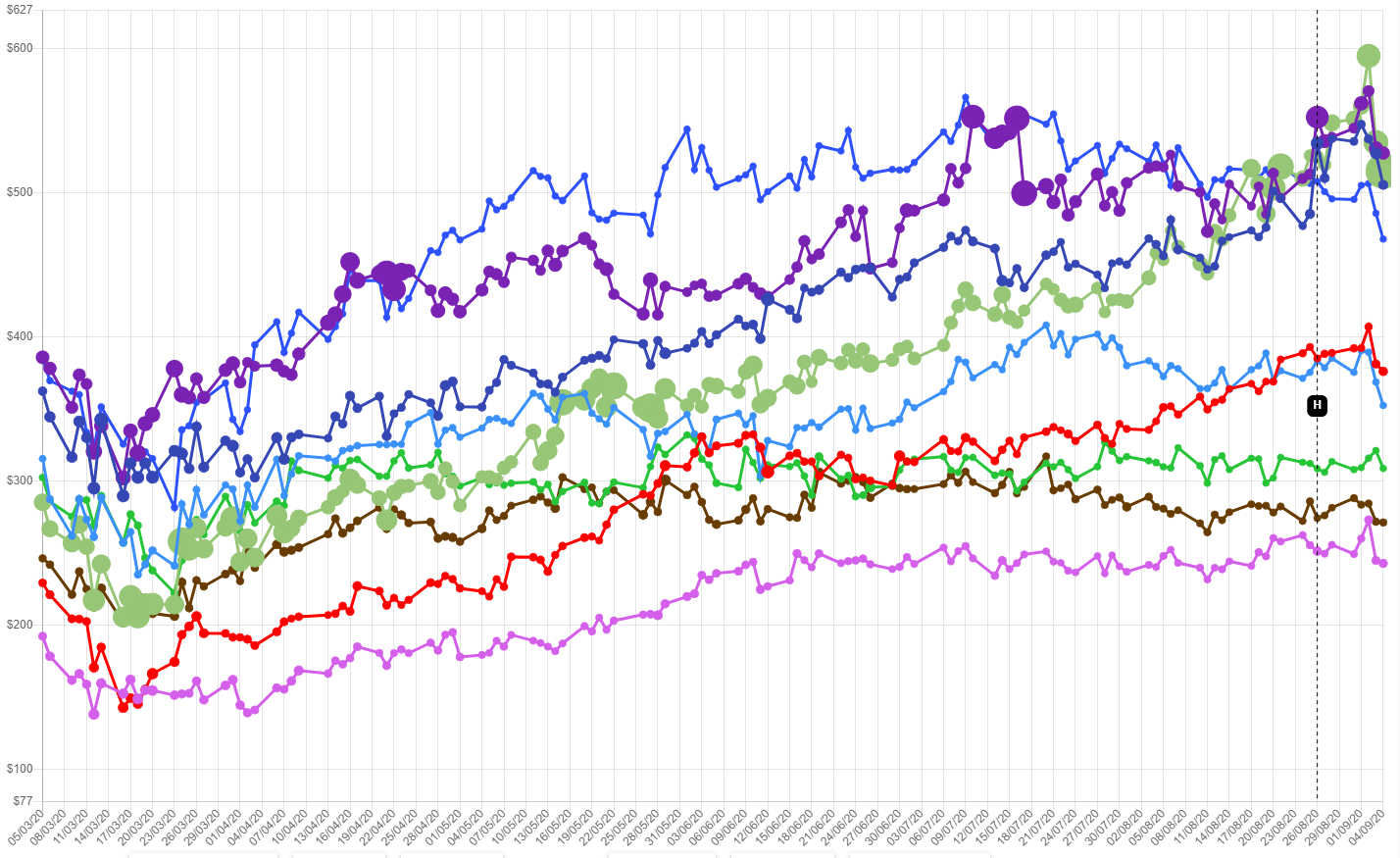
Multi-line comparative chart — the primary mode. Each stock is assigned a colour and drawn as a continuous line over time. This is the workhorse for trend comparison across a query result set.
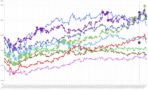
Clean chart (no UI) — the side panel can be collapsed entirely to produce a full-width, unobstructed view of the chart, suitable for presentation or detailed inspection of crossings and divergences.
Logo glyph mode — when enabled, each stock’s most recent data point is represented by its company logo rather than a plain circle. This allows investors scanning many stocks at once to orient by brand rather than colour alone — particularly useful for large portfolio loads.
Case Studies
Three case studies evaluated the system:
Case Study 1 — Query-driven stock discovery: A “High Growth 200–400” query was used to identify stocks matching a specific growth profile. FinVis correctly filtered and rendered the matching set, allowing visual identification of outliers and leading performers within the cohort.
Case Study 2 — Portfolio comparison: Multiple pre-saved portfolios were loaded simultaneously to compare their aggregate trajectories. The comparative multi-line view made divergences and correlations between fund groupings visually immediate in a way no existing tool provided within a single screen.
Case Study 3 — Visual customisation for presentation: Logo glyph mode and data label overlays were used to produce an annotated chart suitable for presentation to a non-technical audience — demonstrating that the system’s output could serve communicative as well as analytical purposes.
Across all three, FinVis demonstrated competitive or superior capability to Google Finance and Seeking Alpha in query specificity and multi-stock comparative display. Limitations centred on meta-data coverage: access to richer financial data fields would enable more expressive queries and deeper screening.
Conclusions and Future Work
FinVis produced a novel approach to financial visualisation — query-first, comparative, and fully configurable — delivered entirely through a web browser without installation. The core contribution is demonstrating that integrating query-building and visualisation in a single persistent view unlocks an exploratory dynamic that split-interface tools cannot replicate.
Future directions identified in the thesis include: micro-visualisation for per-portfolio statistics without requiring click-through; improved interaction directly with individual chart lines for stock-level annotation; additional visual analysis modes for specific meta-data types; and pattern-matching tools that let investors draw a desired stock trajectory before querying for stocks that approximate that shape.
Supervised by Prof. Robert Laramee, University of Nottingham, 2019–2020.