One of the most persistent challenges in spatial analysis is making sense of large point datasets. Whether you’re working with pedestrian movement traces, taxi pickup records, social media check-ins, or environmental sensor readings, raw point clouds quickly become visually overwhelming and analytically intractable. Dots on a map overlap, dense areas saturate, and genuine patterns are buried under noise.
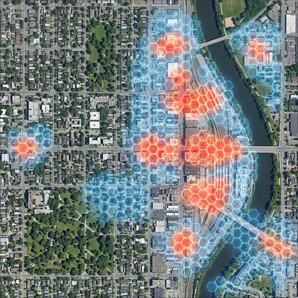
Hexagonal density mapping — aggregating points into H3 cells and colouring them by count — is one of the most effective techniques for revealing spatial patterns hidden in point data. It smooths local noise, highlights genuine concentration areas, and scales elegantly from neighbourhood to continental level.
This tutorial walks through the complete implementation: generating hexagonal grids, aggregating points, building a colour scale, and rendering an interactive choropleth map.
The Core Pattern: Point-to-Cell Aggregation
The fundamental operation is conceptually simple:
- For each point in your dataset, compute its H3 cell index at a chosen resolution
- Count how many points fall into each cell
- Colour each cell proportionally to its count
function aggregateToH3(points, resolution) {
    const cellCounts = new Map();

    points.forEach(({ lat, lng }) => {
        const h3Index = h3.latLngToCell(lat, lng, resolution);
        cellCounts.set(h3Index, (cellCounts.get(h3Index) || 0) + 1);
    });

    return cellCounts; // Map<h3Index, pointCount>
}
That’s the entire aggregation logic. H3 handles all the spatial complexity — computing cell membership, managing resolution levels, ensuring consistent boundaries — so you can focus on the analysis rather than the geometry.
Setting Up the Map
You’ll need Leaflet for rendering and H3.js for the spatial operations. Both load from CDN with no build step required:
<!DOCTYPE html>
<html>
<head>
    <title>H3 Density Map</title>
    <link rel="stylesheet" href="https://unpkg.com/leaflet@1.9.4/dist/leaflet.css" />
    <style>
        #map { height: 480px; width: 100%; border-radius: 8px; }
        .controls { margin: 12px 0; display: flex; gap: 20px; align-items: center; }
        .stat-panel {
            background: #f0f4f8;
            padding: 10px 14px;
            border-radius: 6px;
            font-family: monospace;
            font-size: 13px;
            margin-top: 10px;
        }
    </style>
</head>
<body>
    <div class="controls">
        <label>Resolution:
            <input type="range" id="resolution" min="4" max="10" value="7" />
            <span id="resValue">7</span>
        </label>
        <label>Points:
            <input type="range" id="pointCount" min="100" max="2000" step="100" value="500" />
            <span id="pointValue">500</span>
        </label>
        <button id="regenerate">Regenerate Points</button>
    </div>
    <div id="map"></div>
    <div class="stat-panel" id="stats">Loading…</div>

    <script src="https://unpkg.com/leaflet@1.9.4/dist/leaflet.js"></script>
    <script src="https://unpkg.com/h3-js@4.3.0/dist/h3-js.umd.js"></script>
</body>
</html>
Interactive Demo: Hexagonal Density Map
This demo generates synthetic urban activity points distributed across several simulated hotspots and visualises their density using H3. Adjust the resolution and point count sliders to see how aggregation changes the analytical picture.
What you’ll learn:
Density mapping with H3 converts raw point coordinates into a choropleth where each hexagon’s colour reflects the concentration of activity in that area. You’ll observe how resolution fundamentally shapes the analytical story — coarser resolutions reveal district-level patterns whilst finer resolutions expose street-level variation within the same dataset.
How to use:
Move the resolution slider to adjust hexagon size (higher values create smaller, more precise hexagons). Use the points slider to change the number of synthetic activity points. Click “Regenerate Points” to create a new random dataset with the same cluster structure. Hover over any hexagon to see its exact point count.
Key concepts demonstrated:
Spatial Binning converts continuous coordinate data into discrete groups, making aggregation and comparison tractable. Choropleth Colouring maps a numeric value (point count) to a sequential colour scale, revealing spatial patterns without requiring specialised mapping knowledge. Resolution Sensitivity shows how the same underlying data tells different analytical stories at different scales — one of the most important things to understand when designing a density analysis pipeline.
const map = L.map('map').setView([51.508, -0.095], 11);
L.tileLayer('https://{s}.tile.openstreetmap.org/{z}/{x}/{y}.png', {
attribution: '© OpenStreetMap contributors'
}).addTo(map);
let hexLayers = [];
let currentPoints = [];
// Generate synthetic clustered points across London
function generateClusteredPoints(count) {
const clusters = [
{ lat: 51.515, lng: -0.090, weight: 0.35 }, // City core
{ lat: 51.497, lng: -0.135, weight: 0.30 }, // South Bank
{ lat: 51.532, lng: -0.120, weight: 0.20 }, // Islington
{ lat: 51.504, lng: -0.060, weight: 0.15 } // Canary Wharf
];
const points = [];
clusters.forEach(cluster => {
const n = Math.round(count * cluster.weight);
for (let i = 0; i < n; i++) {
const angle = Math.random() * 2 * Math.PI;
// Box–Muller approximation for Gaussian spread (~2 km radius)
const u = (Math.random() + Math.random() + Math.random() - 1.5);
const r = Math.abs(u) * 0.018;
points.push({
lat: cluster.lat + r * Math.cos(angle),
lng: cluster.lng + r * Math.sin(angle) * 1.5
});
}
});
return points;
}
// Sequential colour scale: pale yellow → deep red, with power compression
function getColor(count, maxCount) {
const t = Math.pow(count / maxCount, 0.55); // power scale for perceptual contrast
const r = Math.round(255 * Math.min(1, t * 1.8));
const g = Math.round(255 * Math.max(0, 1 - t * 1.1));
const b = Math.round(40 * (1 - t));
return `rgb(${r},${g},${b})`;
}
function renderDensityMap(points, resolution) {
hexLayers.forEach(l => map.removeLayer(l));
hexLayers = [];
// Aggregate
const cellCounts = new Map();
points.forEach(({ lat, lng }) => {
const idx = h3.latLngToCell(lat, lng, resolution);
cellCounts.set(idx, (cellCounts.get(idx) || 0) + 1);
});
const maxCount = Math.max(...cellCounts.values());
// Render
cellCounts.forEach((count, h3Index) => {
const boundary = h3.cellToBoundary(h3Index, true);
const layer = L.polygon(boundary, {
color: 'none',
fillColor: getColor(count, maxCount),
fillOpacity: 0.78,
weight: 0
}).addTo(map);
layer.bindTooltip(`${count} point${count !== 1 ? 's' : ''}`, { sticky: true });
hexLayers.push(layer);
});
// Update stats
const avgArea = h3.getHexagonAreaAvg(resolution, h3.UNITS.km2);
document.getElementById('stats').innerHTML =
`<strong>Occupied cells:</strong> ${cellCounts.size} | ` +
`<strong>Max count:</strong> ${maxCount} | ` +
`<strong>Resolution ${resolution} avg area:</strong> ${avgArea.toFixed(3)} km²`;
}
// Wire up controls
const resSlider = document.getElementById('resolution');
const ptSlider = document.getElementById('pointCount');
resSlider.addEventListener('input', () => {
document.getElementById('resValue').textContent = resSlider.value;
renderDensityMap(currentPoints, parseInt(resSlider.value));
});
ptSlider.addEventListener('input', () => {
document.getElementById('pointValue').textContent = ptSlider.value;
});
document.getElementById('regenerate').addEventListener('click', () => {
currentPoints = generateClusteredPoints(parseInt(ptSlider.value));
renderDensityMap(currentPoints, parseInt(resSlider.value));
});
// Initial render
currentPoints = generateClusteredPoints(500);
renderDensityMap(currentPoints, 7);Notice how increasing the resolution from 7 to 9 or 10 breaks the district-scale blobs into finer patterns, sometimes revealing sub-structure that was invisible at coarser scales. Decreasing to 5 or 4 merges everything into a few continental-scale cells. Choosing the right resolution for your analysis is as much an analytical decision as a technical one.
Choosing the Right Colour Scale
The colour scale has an outsized impact on how readers interpret density patterns. Two common problems undermine otherwise good density maps:
Linear scales with skewed data. If a few cells have counts five or ten times the median, most of the map renders uniformly pale. A square root or power scale compresses the high end and reveals variation across the full distribution:
// Linear: hotspots dominate, everything else appears uniform
const t_linear = count / maxCount;

// Square root: better contrast at the low end
const t_sqrt = Math.sqrt(count / maxCount);

// Power 0.4–0.6: typical range for urban point data
const t_power = Math.pow(count / maxCount, 0.5);
Too many hue transitions. Rainbow colour scales (red → yellow → green → blue) are visually striking but introduce artificial boundaries and make it harder to read relative magnitudes. Sequential single-hue scales (light to dark) or perceptually-uniform palettes (like Viridis or Plasma) communicate density more accurately.
For urban activity data with natural hotspots, a square root scale with a pale-to-dark sequential palette typically gives the most readable result.
Performance Considerations
For datasets with tens of thousands of points, the aggregation step is fast — H3 index computation is O(n) and very efficient. The bottleneck is usually DOM rendering when drawing large numbers of hexagonal polygons.
Practical limits for Leaflet SVG rendering:
- Under 1,000 hexagons: Instant render, no lag
- 1,000–5,000 hexagons: Slight initial delay, smooth interaction
- Over 10,000 hexagons: Switch to Canvas or WebGL
Enable Leaflet’s Canvas renderer for denser maps:
const map = L.map('map', {
    renderer: L.canvas()
}).setView([51.505, -0.09], 10);
Canvas renders hexagons 3–5× faster than SVG for dense layers. The trade-off is that per-element hover events require manual hit-testing rather than native DOM event handling.
For production applications with millions of points, pre-aggregate server-side using H3’s Python library or the DuckDB H3 extension, then send only the cell counts to the browser:
import h3
import duckdb

# DuckDB H3 extension: aggregate million-row dataset in seconds
conn = duckdb.connect()
conn.execute("INSTALL h3 FROM community; LOAD h3;")

result = conn.execute("""
    SELECT
        h3_latlng_to_cell(lat, lng, 8) AS h3_index,
        COUNT(*) AS point_count
    FROM events
    GROUP BY h3_index
""").fetchall()
This pattern keeps the browser payload to a few thousand cell-count pairs regardless of the underlying dataset size.
Next Steps
Hexagonal density mapping is a foundation for more sophisticated spatial analyses:
- Temporal layers: Stack multiple time-period density maps to animate change or compute difference maps
- Normalised rates: Divide counts by cell population or land area for rate maps rather than raw count maps
- Statistical hotspots: Apply Getis-Ord Gi* or kernel density estimation on top of H3-aggregated counts
- Server-side pre-aggregation: Use BigQuery, PostGIS, or DuckDB with H3 extensions for datasets that won’t fit in browser memory
The next tutorial in this series covers H3’s catchment analysis capabilities — using k-ring functions to build spatial buffers and model service areas with hexagonal precision.